Khamoro
- Visual Identity System
- Custom Logotype
- Art direction
- Social media Applications
- Environmental Applications
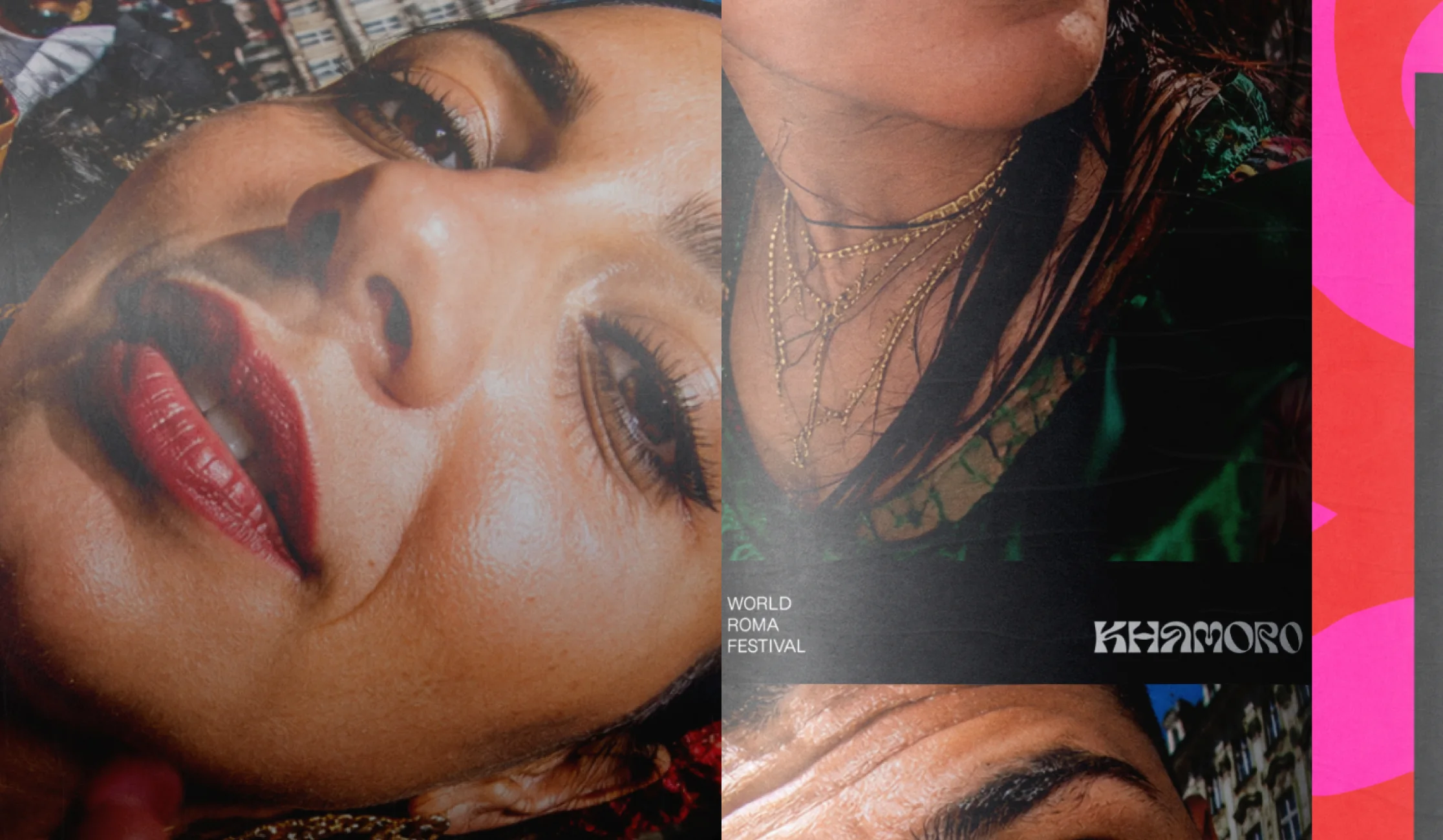
Khamoro means sun in Romani. For Prague's World Roma Festival, we wanted an identity that expressed the richness and movement of the culture itself. Inspired by the folds, forms and rhythm of traditional Romani dress, we redrew the festival's lettering into a distinctive visual language. Individual characters become patterns, compositions and bold graphic statements. A system that can change endlessly without losing its identity.
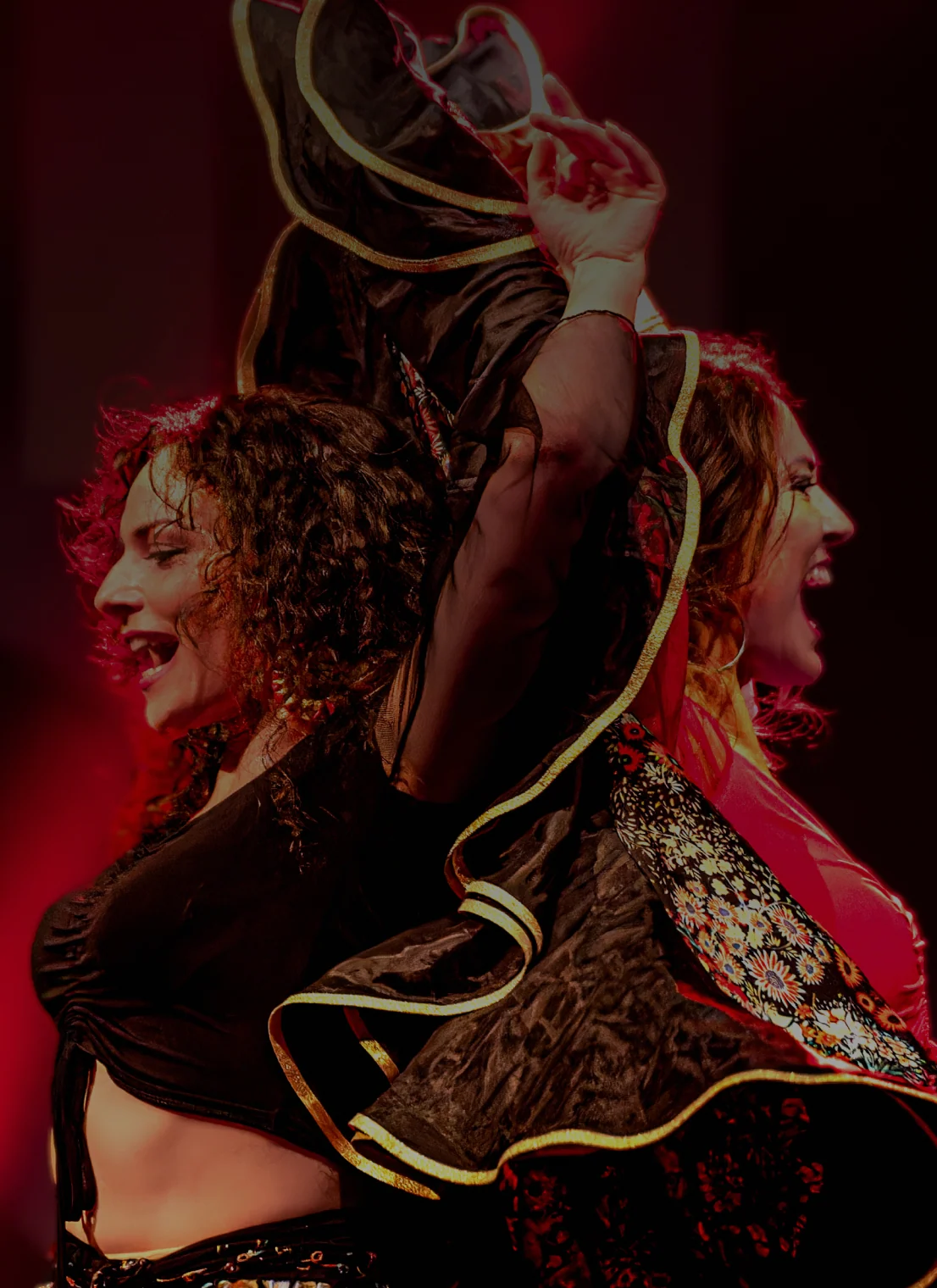
The Khamoro logotype takes inspiration from the movement, volume and flowing silhouettes found in Romani dress and performance. Folds and curves are abstracted into custom letterforms, connecting the identity to its cultural context without relying on literal symbols.
Built from fluid letterforms and repeatable modules, the system can expand across print, digital, textiles and spatial applications. Its abstract language preserves cultural resonance without reducing it to a single literal image.
Red anchors Khamoro's identity, while black and white provide a neutral foundation for clarity and contrast. Pink, orange, yellow and cyan extend the palette into a more expressive register, allowing the system to shift in tone and intensity across different contexts. Colour can change; recognition remains rooted in the custom letterforms, graphic forms and typographic structure.
A flexible grid provides the structure for Khamoro's information system. Scale, position and spacing create clear hierarchies while allowing each composition to adapt to different content and formats. The system balances consistency with freedom, giving information room to shift without losing clarity or recognition.
A flexible grid provides the structure for Khamoro's information system. Scale, position and spacing create clear hierarchies while allowing each composition to adapt to different content and formats. The system balances consistency with freedom, giving information room to shift without losing clarity or recognition.
When photography can be commissioned, Khamoro follows a clear direction: close, energetic and immersive images that capture the festival from within. In practice, much of its imagery comes from different people, sources and contexts. The identity is designed to support both realities. Typography, colour and graphic forms give directed photography a distinctive voice, while allowing spontaneous or inconsistent images to sit naturally within the same recognisable system.
The visual system adapts naturally to social media, combining typography, photography, colour and graphic forms within a flexible composition. Each layout can shift according to the content while maintaining a consistent visual language, allowing Khamoro to communicate different artists, events and information without relying on a fixed template.