IE University
- Brand System
- Sub-brand Identities
- Colour & Typography Tokens
- Illustration System
- Grid & Layout

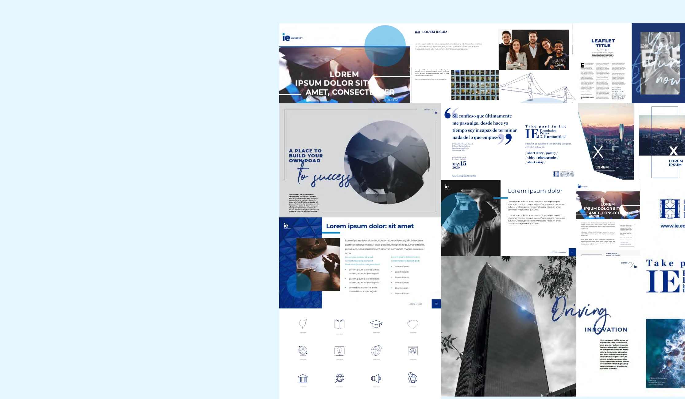
A university is never just one thing. Different schools, programmes and audiences need room to express themselves, without losing their connection to the institution. For IE University, we developed a system built around six shared brand principles, including a circle derived from the letterforms of the logo. These common elements create consistency while leaving space for each school to establish its own character. One recognisable institution, with the flexibility to speak in many voices.
The challenge
The primary challenge was to achieve consistent communication across a global institution with multiple departments spread across different regions, with its headquarters in Madrid. The task was to identify a brand asset that not only embodied the corporate identity but also possessed the flexibility to be adapted across various applications, ensuring its maximum versatility and effective use in diverse contexts and cultures.
Solution
Given that the previous brand identity frequently incorporated the circle and drew upon key elements from the logo—such as the distinctively coloured dot above the letter “i” and the circular form of the lowercase “e”—I determined that the circle should serve as the cornerstone of our brand strategy and identity. Consequently, the design of all internal identities required by the institution was anchored in the circle, presenting a substantial creative challenge in maintaining brand consistency over the long term.
Colours
Colour tokens define a palette of colours and their associated values, ensuring that all design elements maintain a uniform and cohesive colour scheme. These tokens are used to ensure brand consistency and create a recognisable and harmonious visual identity across various materials and platforms. Here we can see both IE main branding colours: good contrast for small text (below 18pt) and great contrast for large text (above 18pt or bold above 14pt).
Typography
The use and selection of the variables mentioned here should be decided according to the amount of text and optimal reading contrast.
Grid
Create different visual identities so that the IE University brand can adapt itself in order to cover different purposes. Visual identities with different voices, that align between each other and with the IE University brand. Although it is expressed differently depending on the message wanted to be transmitted, it has common factors. Even though the brand has different voices, you always know that it is IE University who is speaking.
Illustration
The approach to illustration focuses on using strokes that convey a more human touch, aiming to counterbalance the inherent rigidity of the circle within the visual identity. However, these illustrations will always be contained and organised through a grid system to ensure visual coherence and balance. There are two primary methods for developing the illustrations: the first involves freehand drawing, tailored to the specifications of the relevant brief; the second method is based on an existing image, over which elements or people can be highlighted through drawing. In both cases, only the corporate colours will be used. Below are some examples that demonstrate these approaches.
IE Women
IE Rankings
IE The Next Fifty
Other identities
Resume