Fichap
- Brand Evolution
- Graphic Language
- Colour & Gradient System
- Data Visualisation
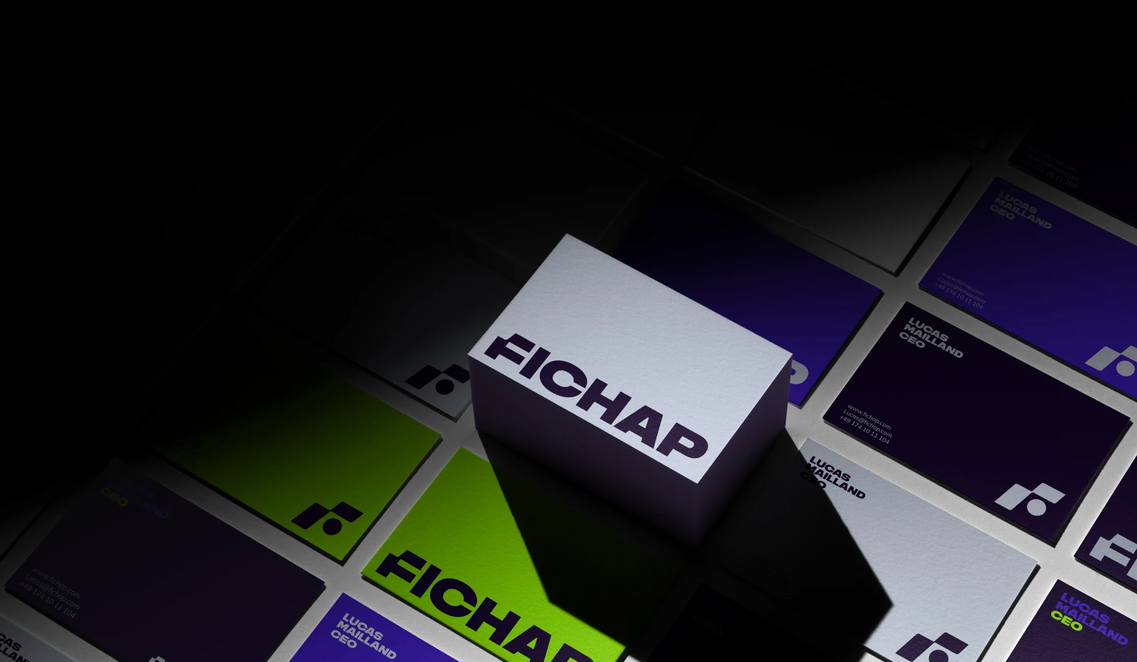
Startups change. Their brands need to keep up. Having designed Fichap's identity through several stages of its development, Martin brought those iterations together into a more cohesive, mature visual system. A small dot within the symbol became the starting point for an adaptable graphic language, extending naturally across communications and the digital product. An identity built to support the business as it grows.
Typography
Bolden is a modern, bold typeface that conveys confidence and strength. Its sturdy design reflects Fichap’s values of solidity, professionalism and adaptability. Boldline is an elegant, versatile sans-serif offering excellent readability across sizes and weights, ideal for body text, subtitles and brand communications.
Colour variants
Fichap's colour palette is designed to offer flexibility and cohesion across every brand application. Each core colour comes with primary, secondary, tertiary and quaternary shades, with lighter and darker tones at every level, keeping designs versatile without losing consistency.
Gradients
Our brand gradients are a subtle way to bring the identity's two visual principles to life: connection and dynamism. Used across communication design, they add depth, layering, emotion and a sense of transition.
Bars and graphics
Charts and data graphics are built from the same pieces as the identity: rounded bars, the brand palette and generous spacing. Dashboards, reports and campaign visuals all read as part of the Fichap world, turning workforce data into something clear and easy to act on.