Cupra Raval
- Visual Identity System
- Custom Typography
- Layout System
- Art Direction
Barcelona's Raval is a collision of cultures, languages and identities. Naming a car after it called for something more interesting than a conventional automotive campaign. We created a typographic language where every letter has a different personality, reflecting the diversity of the streets that inspired it. The identity shifts between expressive and minimal, analogue and digital, always grounded in the raw energy of the neighbourhood.
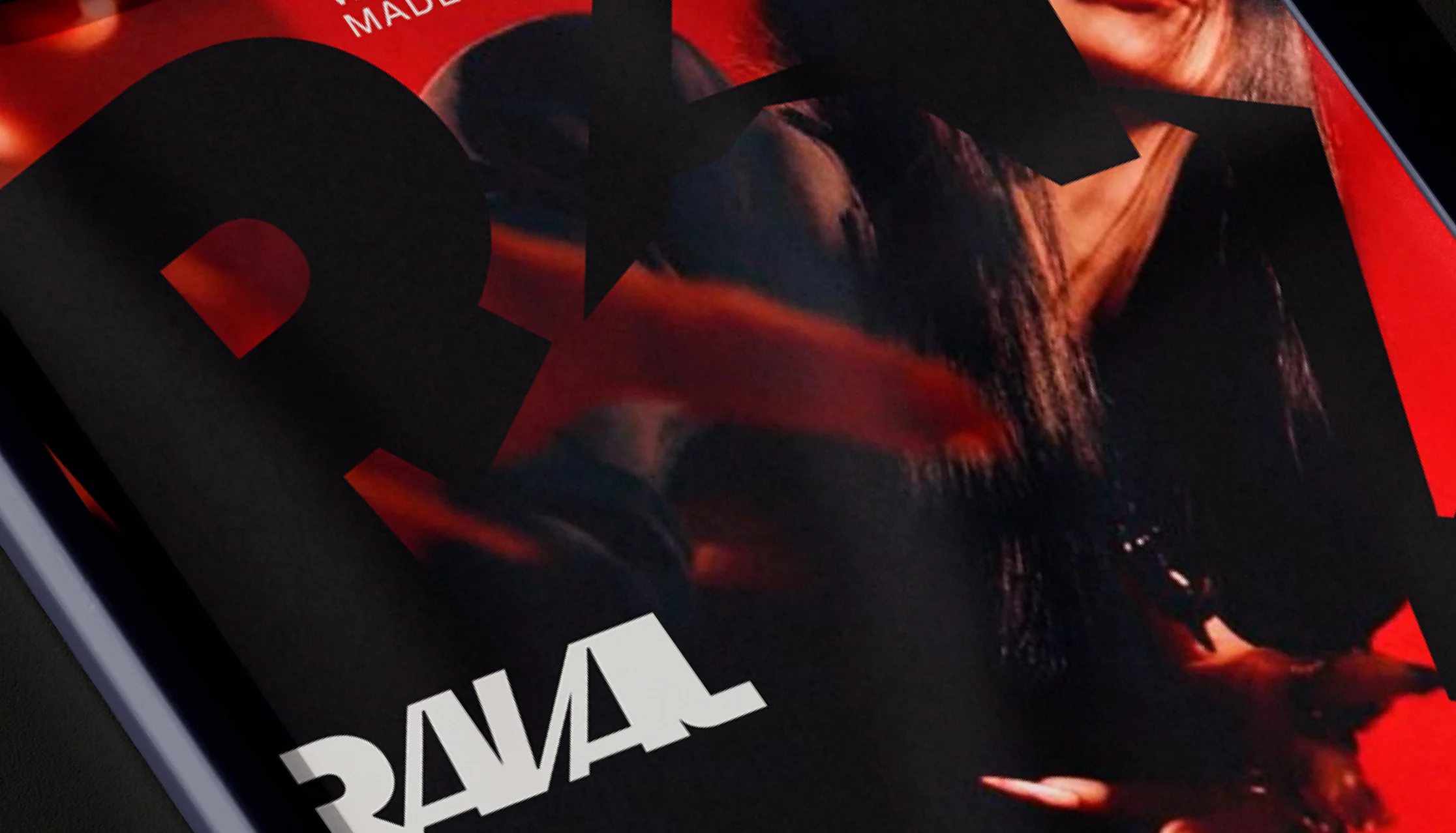
The symbol does not present itself as a unique and perfect brand. It behaves like the Raval: it changes, erodes, reconfigures, and retains its essence. The base form remains, but its variations express the textures of the neighbourhood: graffiti, improvised signage, wear, intervention, and street life. A stable sign in structure, variable in expression. A brand that exists in the plural, just like its context.
The typography is built with the same logic as the neighbourhood: Multiple origins coexisting in the same space. Each letter corresponds to a different structure to reflect the cultural and visual mix of the Raval. It does not seek uniformity. It embraces contrast, layering, and urban character. It is a variable and imperfect system by design: identity in motion, like the territory it represents.