CUPRA
- Symbol Construction
- Visual Identity System
- Campaign Design
- Layout System
- Iconography
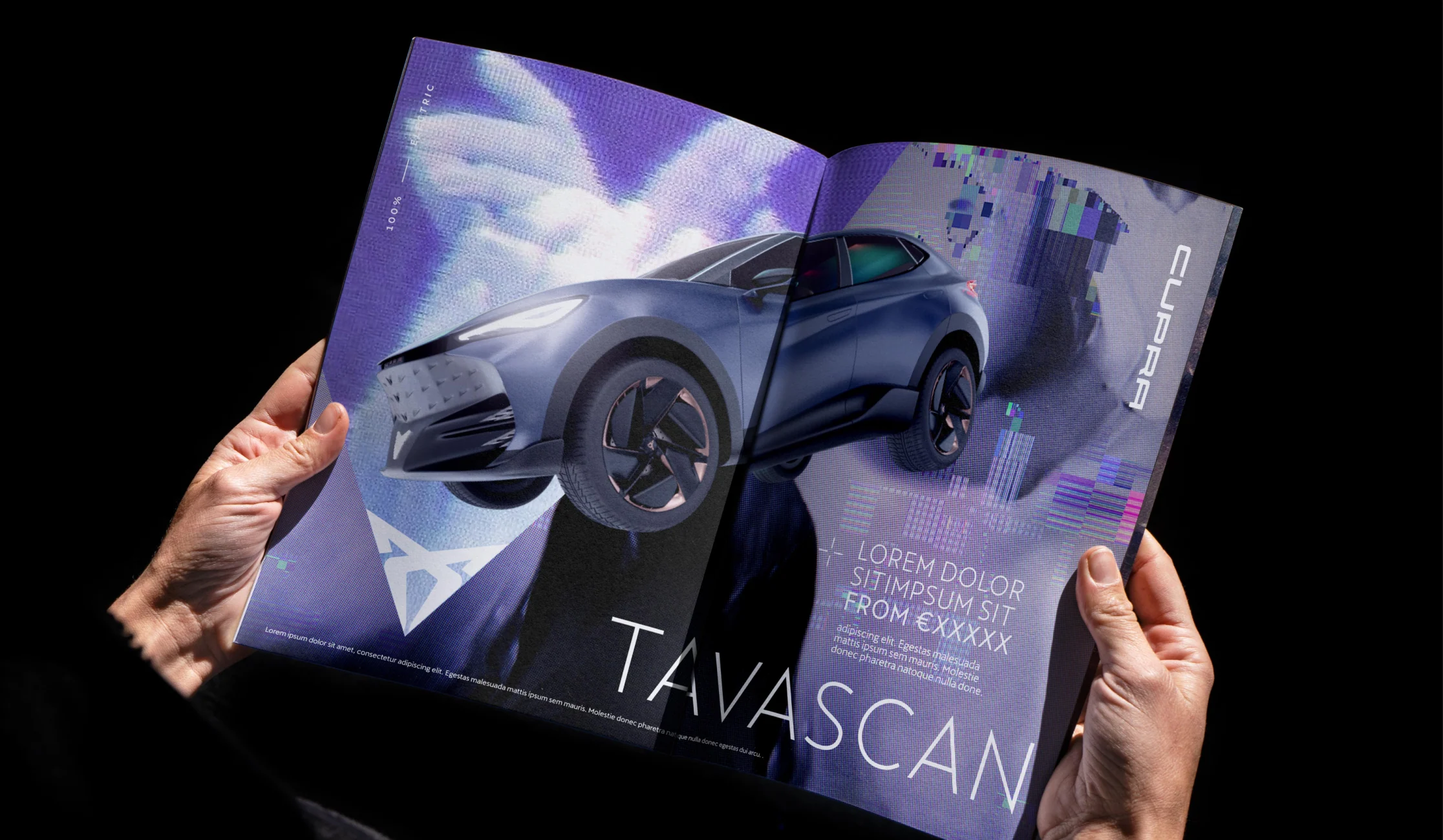
A distinctive identity doesn't need endless elements. It needs one powerful idea. Hidden in the geometry of CUPRA's symbol, we found a triangle that could become the foundation for an entire visual language. From layouts and iconography to campaigns across markets, every element follows the same underlying principle. A simple shape with the power to hold a whole brand together.
Process construction
By combining the aforementioned constants and adding certain features such as the circle and the cut to shape 04, the end result is the creation of the pictogram.