Coptown
- Visual Identity
- Character Design
- Flavour System
- Logo Design
- Naming
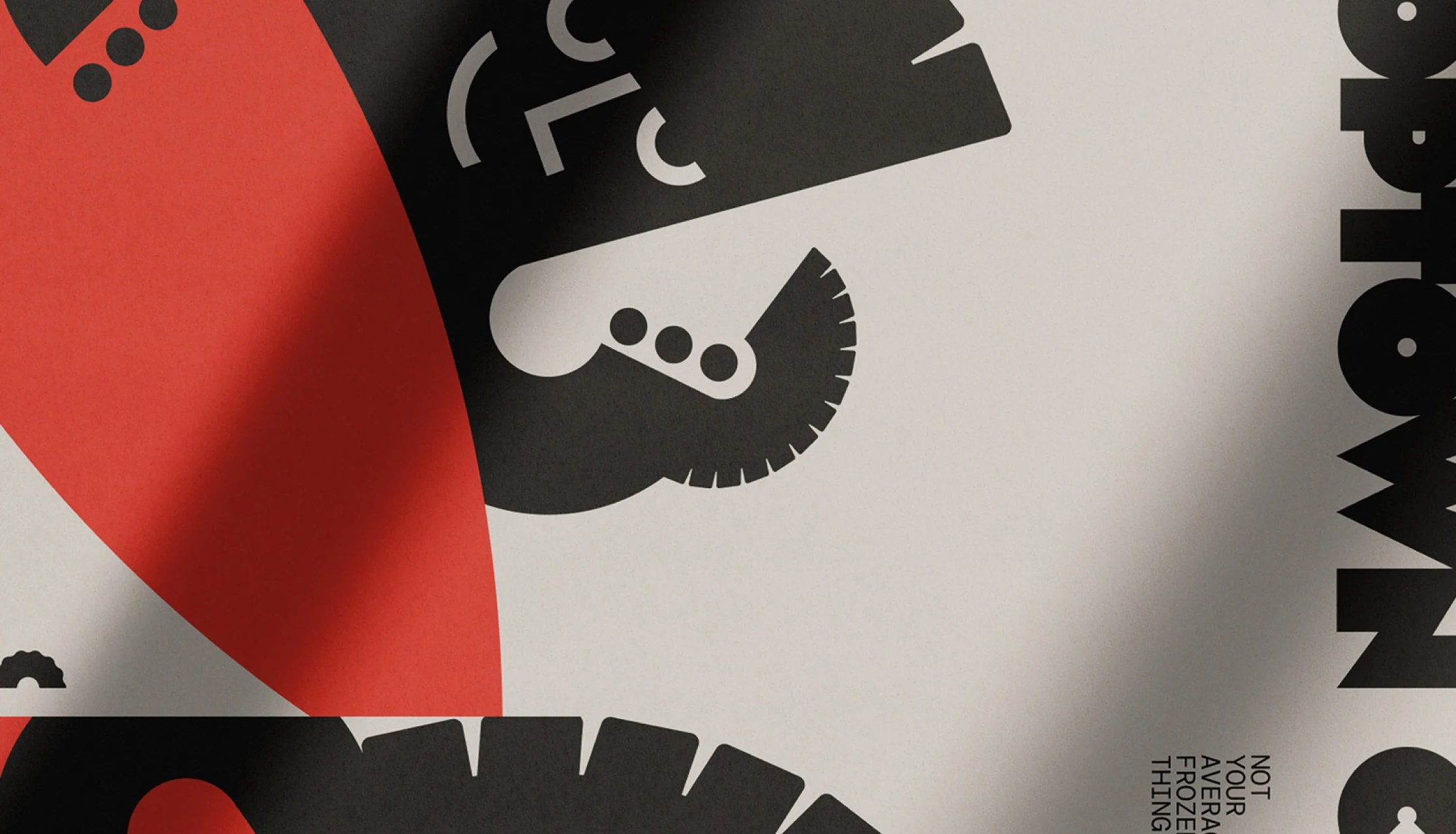
How do you turn a much-loved local food business into a brand ready to travel? For this Sydney-based empanada company, the answer was hiding in the pastry. We renamed Copetín as Coptown and built the identity around the repulgue, the traditional hand-crimped edge of an empanada. Its distinctive form became both the letter C and a playful wave, bringing a little Sydney surf culture into the mix. Different crimps, colours and characters give every flavour its own personality.