Alpega
- Brand Evolution
- Symbol Refinement
- Visual Language
- Layout System
- Art Direction
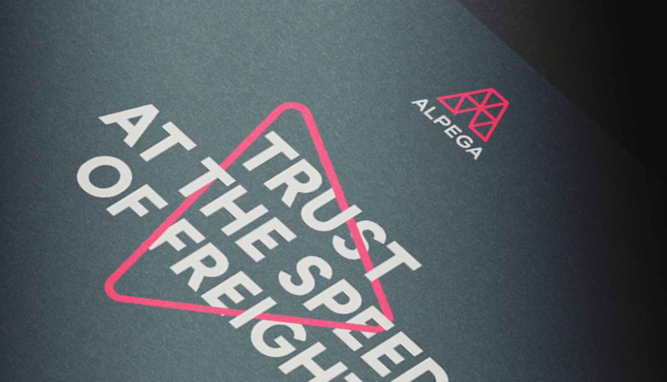
Not every brand needs to start again. Alpega already had a recognisable symbol; what it needed was a stronger visual language around it. We refined the existing mark and gave its triangular geometry a more active role. The triangle became a device for framing photography, structuring layouts and directing attention. A considered evolution that made more of what the brand already owned.
Alpega did not need another identity. It needed a sharper expression of the one it already had. The challenge was to modernise the brand without losing recognition—and to move beyond the predictable visual codes of logistics. Every change needed to create progress without erasing familiarity. New, but unmistakably Alpega.
The solution
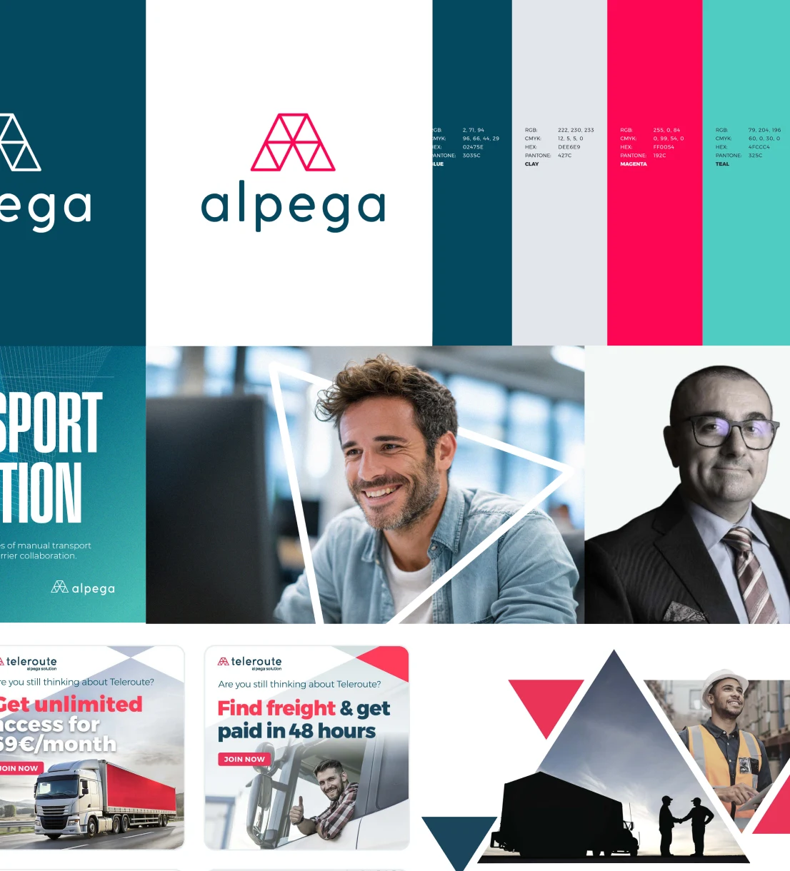
The triangle was already central to Alpega. We gave it a more purposeful role. Moving beyond repetition and decorative collage, it became a system for framing imagery, shaping layouts and guiding attention. What was once a familiar motif became a sophisticated design principle—clearer, more distinctive and built to scale.
A familiar shape became a flexible visual language.